The dashboard-first design brief
Most iGaming products are designed from the marketing site inward. The ones that retain players longest are designed from the player dashboard outward. Here is how to flip the brief.

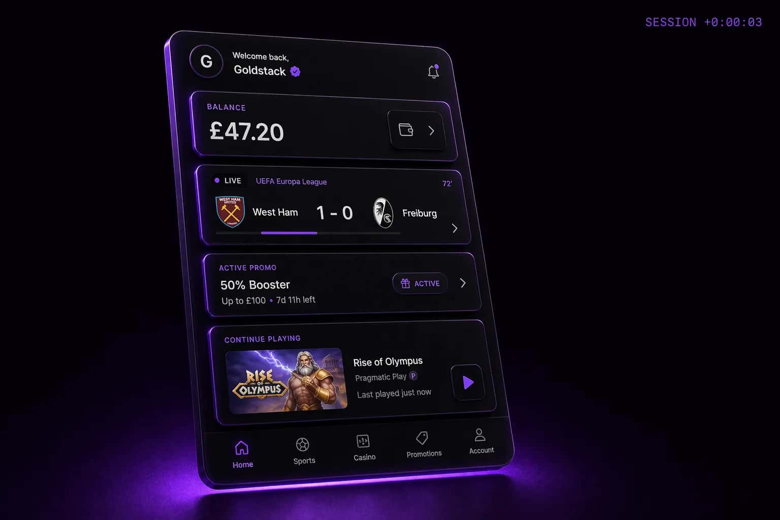
The conventional design brief for an iGaming product starts with the homepage and works inward: hero, registration flow, lobby, game. The problem is that every returning player — the players who generate 80% of your revenue — enters through the dashboard, not the homepage. You are designing the front door and ignoring the house.
What the dashboard needs to answer in three seconds
- What is my current balance and bonus status?
- What events or games are live right now that are relevant to me?
- Is there an active promotion that I should act on today?
- Where do I go to do the thing I did last time?
Players who get a clear answer to all four questions within three seconds of logging in have a 40% higher 30-day retention rate than those who have to navigate to find any of them.
The brief rewrite
Start your next product brief with the returning player state. Design the dashboard for a player who logged in yesterday, has a £47 balance, has a pending free spin offer, and wants to bet on tonight's match. When that experience is excellent, the acquisition experience — which a player sees once — can optimise for conversion without being cluttered by retention signals.
The two personas — acquisition and retention — need different designs. Most products try to serve both from the same authenticated view and fail both.
Ex-Razer / ex-Pragmatic Play. Runs the studio and owns every client relationship.